A guide for what you should wear for a photoshoot!
For most people knowing what to wear is intuitive but for others it might be stressful figuring out what to wear and if it will look right for the photoshoot. I wanted to make this blog post to help those who might need a bit of guidance. My first tip would be no logos! Sometimes people eyes will go to the logos first which could be a bit distracting in the photos and feel less elevated. You want texture! Think of linen, cotton, knit, satin, and chiffon. You can even mix these different fabrics together. Also, no neon colors, this also will also super distracting and strenuous to the eyes. Instead, you would want to choose analogous, monochromatic, or complementary colors. You want harmony.
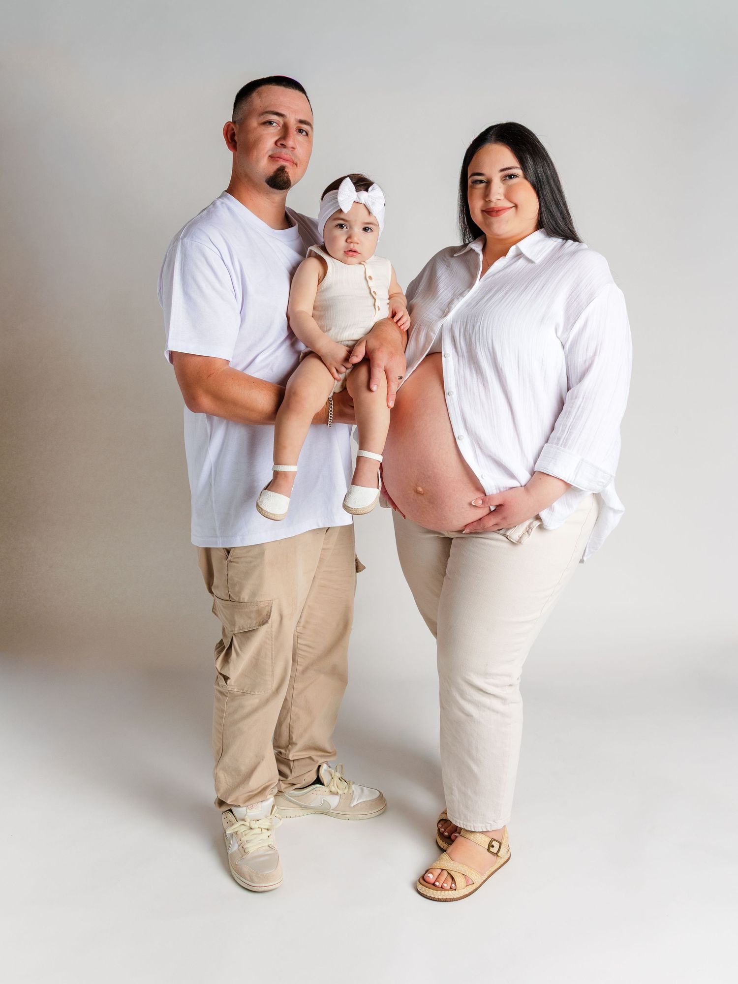
Monochromatic
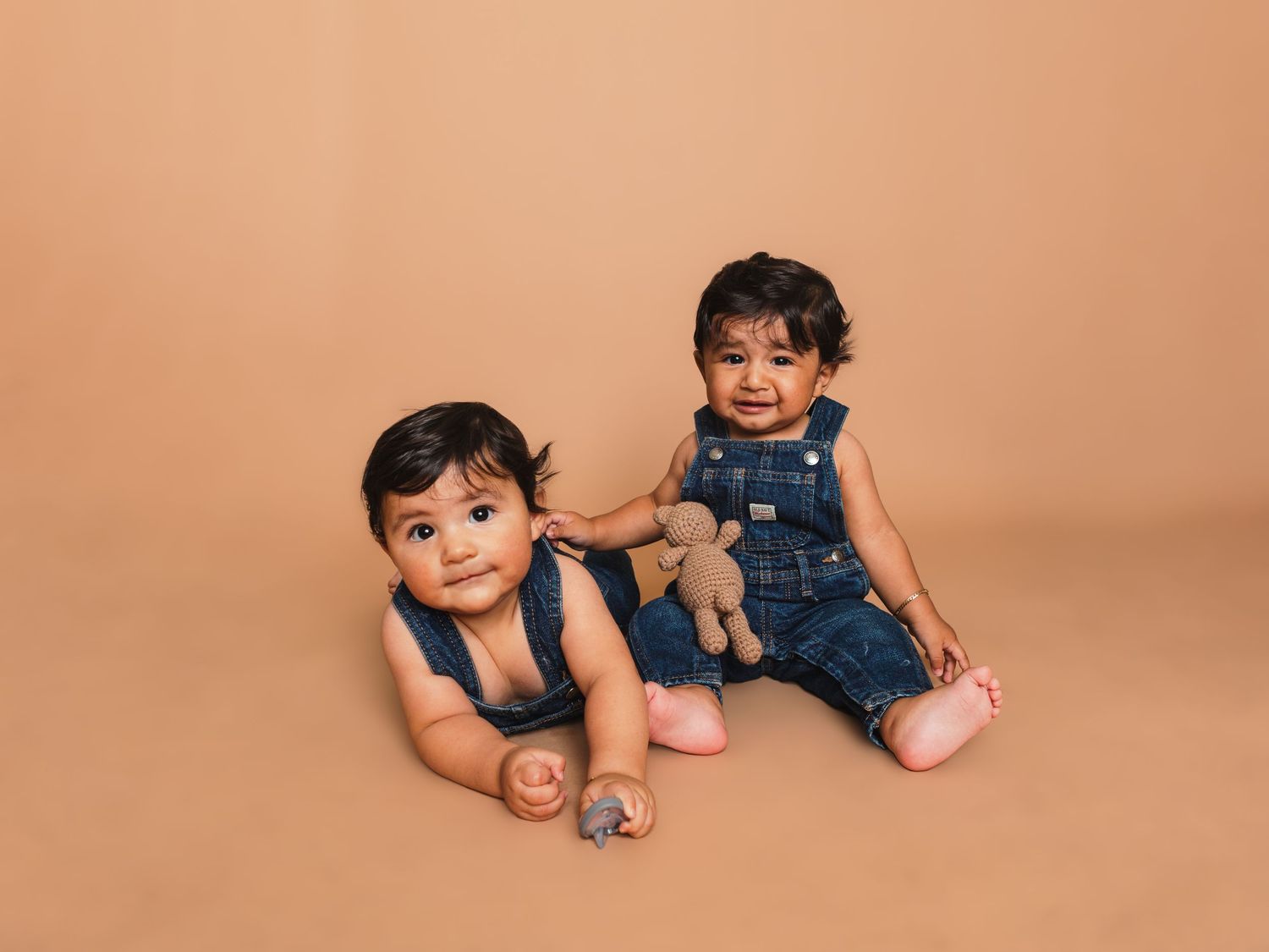
Monochromatic means one color with one different hue and shades. For example, many couples or families love to go with white and cream colored clothing. Mostly everyone has something white or cream in their closet, which is timeless and neutral. You can pair a white cotton shirt with blue jeans, black, olive green pants, or beige.
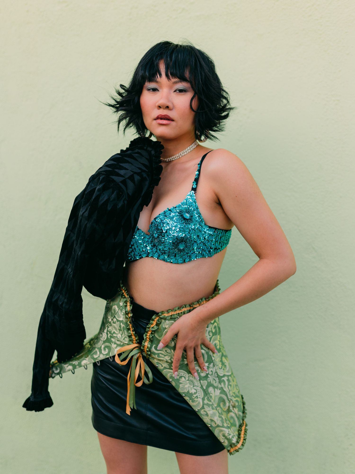
Analogous
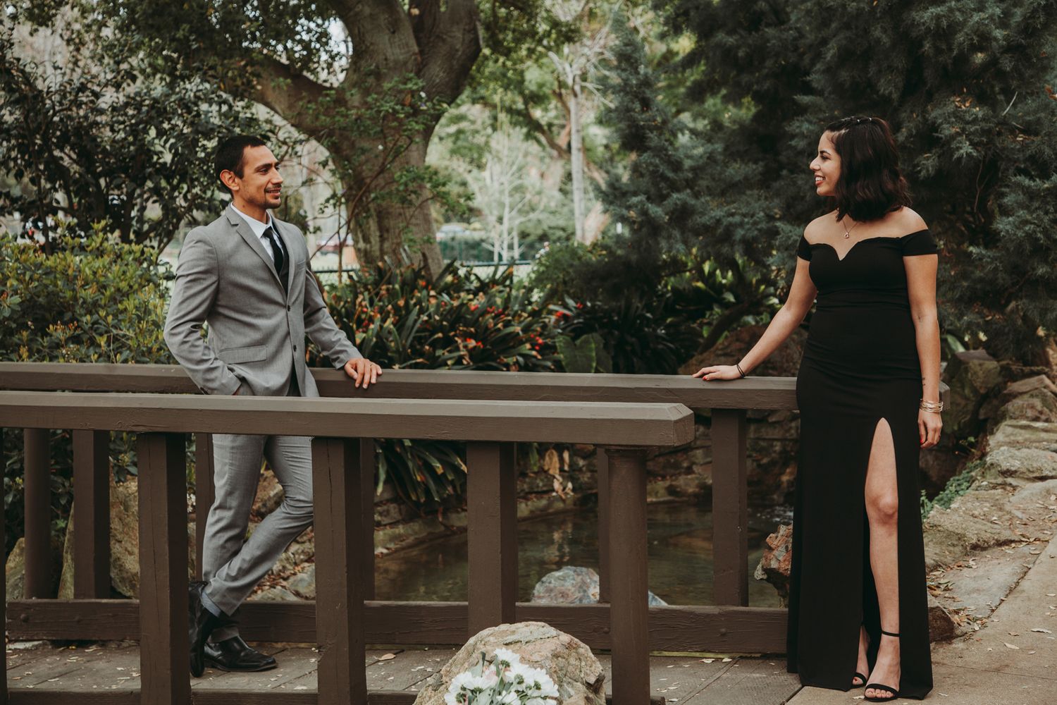
Analogous is colors that are next to each other on the color wheel. Such as yellow, orange, and red. You can play around with these colors. Since they are close to each other in the color wheel. You can pair chose the colors blue and green like this photoshoot I did with a model.
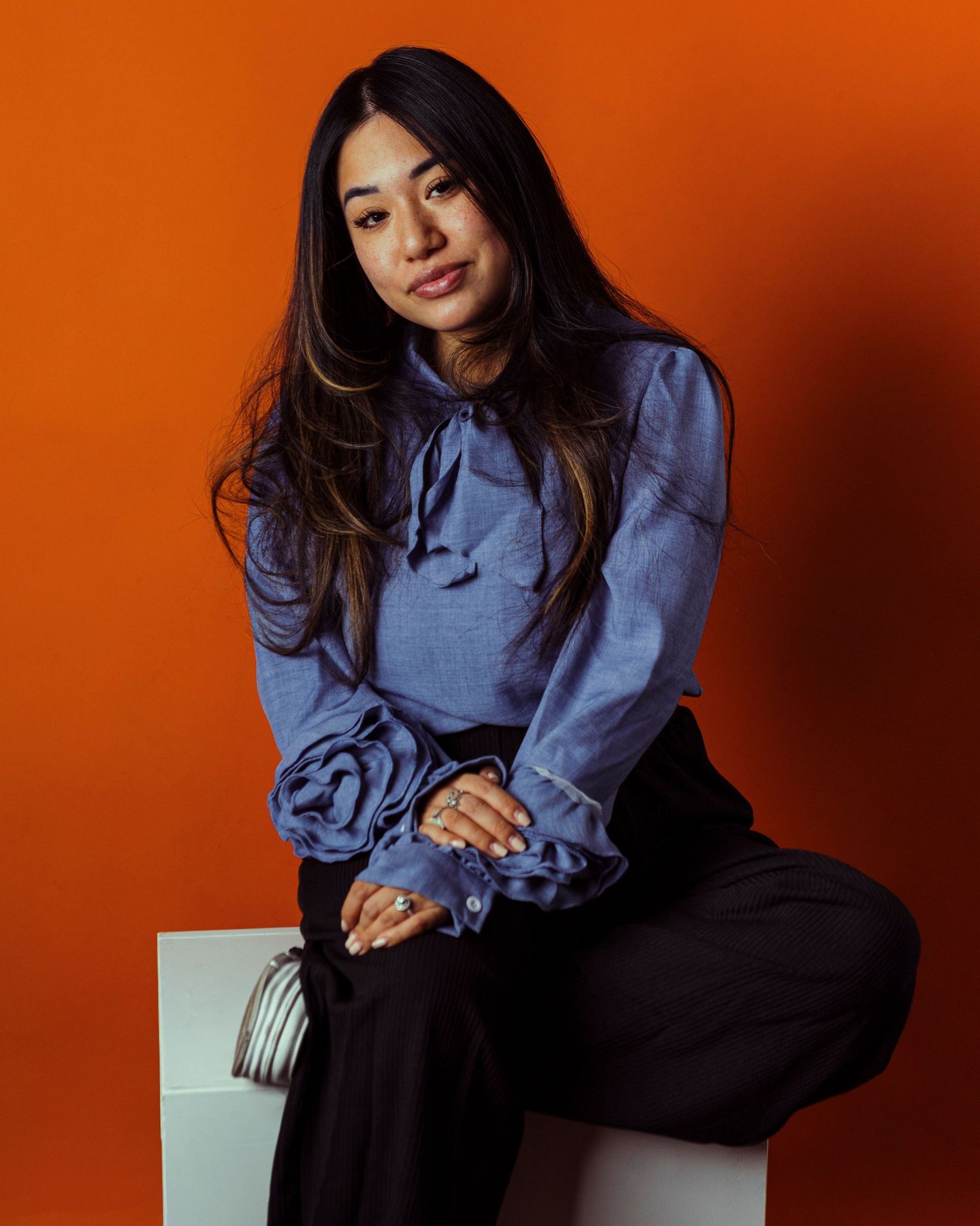
Complementary
The last color scheme is complementary colors. These colors can be fun! They sit across each on the color wheel. For instance blue and orange. You can mix these colors and really make things pop! I find complementary are bit more fun to play around with and if you want create a bold look for your photoshoot.
Patterns and Designs
This could get a little tricky! You have to be careful when styling with patterns and designs. I tell my clients to avoid small stripes or repeating patterns because this can cause an effect called Moiré. This is due to the fact that the camera sensor picks up these details in a weird way that causes these strange patterns. I explained this like we're 5 because this can get pretty technical and hard to explain in simple terms lol. Here is a link if you're interested in all that! (This is my ADHD brain researching the term.)
Things to avoid!
I would ditch the basketball shorts, stained clothing and dirty shoes. You don't want to look like you were not ready for the photoshoot. This gives off an impression that I did not think about what I wearing and I do not care. Unless you're really going for that look lol. Watch out for wrinkles too, it's best to iron your clothing for the photoshoot. Wear something comfortable! If you wear something that will be uncomfortable they translate in your photos so lets avoid that.
Other important tips
- Plan your outfits ahead of time
- Coordinate your outfits, you don't always have to match each other
- Get your make up and hair done
- Self-grooming before photoshoot
- Dress for the location/occasion
In Summary
There are countless ways to work with colors and patterns for your next photoshoot, each offering unique creative possibilities and visual impact. I hope this comprehensive guide has been helpful and informative for you as you plan your upcoming project. If you have any additional questions or would like further clarification on any of the tips covered, please feel free to reach out to me directly. I'm always happy to help and discuss your creative vision.